PROCESS: Panel art
By popular request (one person asked) let's talk art! They actually only asked for how it'd work in Krita, but I've been wanting to do this for a while, so here we go, here's a full breakdown of like. Things I think about while drawing this comic.
- Software
- Work flow
- Process video
- Miscellaneous how-tos
- Theory
- More general advice
- Additional reading
Software
I do all the art and animation for this comic in Krita, which rules. It's free and open-source, which is cool. However, because Krita isn't the bastard Photoshop or the prodigal son Clip Studio Paint, I'm not sure how much of this is going to carry over to other software.
Krita is pretty straight-forward - it's a drawing program! You put down your tablet pen and you draw onto a canvas. Pretty simple stuff. Part of Krita, though, is that it's a really, really bulky program. There are a lot of tools that aren't immediately obvious to use, but that's fine - a good maxim for art software is that 10% of the tools do 90% of the work. You may never use some parts of your software and that's okay - did you know that Blender, the same software that things like Worthikids's cartoon Bigtop Burger was made in, can be used to turn MRI scans into 3D objects? Are you going to do that? Probably not.
I'm currently using a nightly developer build of Krita, so certain dockers may be missing in the release builds, but my Krita layout tends to look something like this.
(All the images in this document are full-resolution, if you want to see them at their full-size, just right click and open them in a new tab.)
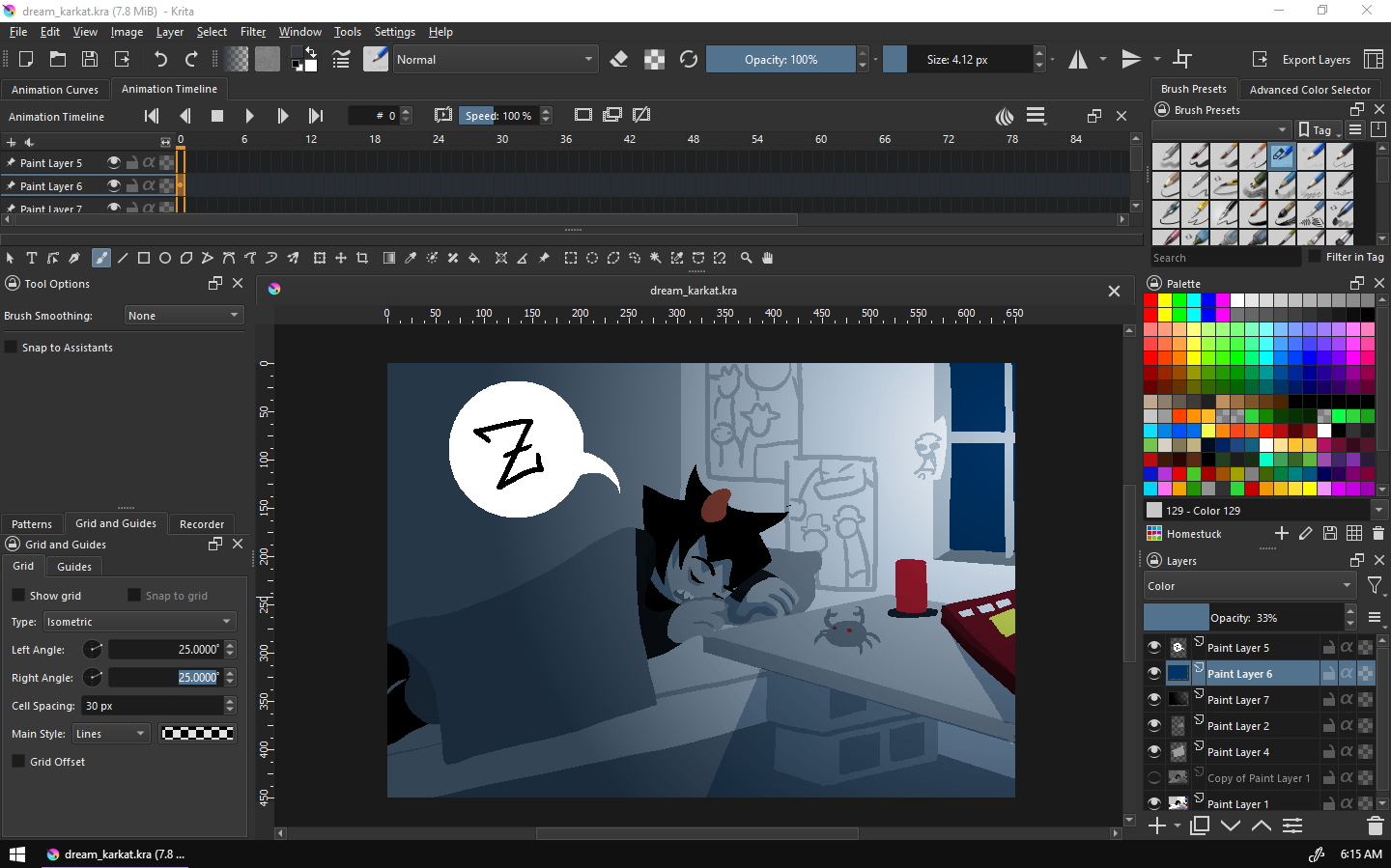
(The Overview docker is floating on another monitor - cannot recommend this one enough, since colors changing between monitor displays is SUCH an issue.)
I'm right-handed and draw on a monitor tablet (UGEE 1910-B, may it rest in peace. It was discontinued just a few months ago... can I get an F in chat.) so the more commonly used things tend to gravitate towards the bottom right of the screen. Things like layers, color palettes, and brushes go on the right, and things like pattern selection, grids, and tool options go on the left.
Along with this, since my monitor tablet doesn't have buttons, I bought a LEFT-HANDED GAMING DEVICE. (This is exactly one half of a keyboard. Cheap ones run $20 and they are infinitely useful.) This brings along some useful shortcuts:
- ` - Toggles "Isolate layer mode", which focuses on one layer on an image.
- Caps Lock - Toggles alpha lock mode, which is a substitute for things like clipping layers from Paint Tool SAI. An alpha locked layer won't change the transparency of a pixel, ever, so you can just draw over art you already have down without changing its silhouette.
- Tab - Turns off the UI. This is useful if you use a monitor tablet that's smaller than your art, and just need to draw.
- Ctrl+Shift+C - Import an image as a new layer. This gets essential when you're doing sprite mode stuff, or more collage-heavy panels, since the "Import image as layer" button is buried in submenus.
- A - Assistant tool. This brings up drawing assistants like perspective grids, vanishing points, etc. and it's invaluable.
- C - Circle.
- R - Rectangle. (This may seem obvious but these aren't actually the default binds, IIRC.)
- Ctrl+V - Paste into active layer. This is only available in the nightly builds, but Krita by default pastes into a new layer. If you're on the nightly builds, make that change.
I've also got a tag of the most immediately useful brushes, to use with the painter's wheel tool. (The painter's wheel is the BEST part of Krita. It owns. It makes everything so much easier.)
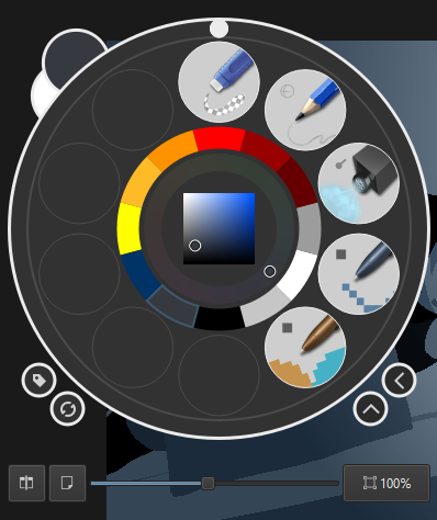
These are Krita stock brushes that have been slightly modified - from top to bottom, these brushes are A) Eraser Small, C) Pencil-1 Hard (scaled down to 4px radius), I) Adjust Lighten (modified to have the Normal blend mode instead of Lighten) U) Pixel Art (adjusted to have size be pressure sensitive, and set to a radius of 5.5px) and U) Pixel Art Fill. (which is set to the Erase blend mode)
I'll get more into these brushes in a bit.
Work flow
That's a scary word, but maximizing the amount of stuff you get done is pretty essential to making the MSPA house style work for you, and planning what you're going to do and how is great for that.
Step 1: WRITING
Story structure, dialogue, character expression - all of this is outside of the scope of this. So we're gonna condense this.
I imagine each update as a "scene" first, a sequence of about 10-30 pages.
Grouping them like this makes it easier to keep things moving, and it helps things cohere - there are certain sections in Homestuck where the comic will jump between three perspectives in three different scenes about three different things in three different pages and while Homestuck gets away with it because of its inherent novelty from its time and the lenience granted by reader submissions, most hypertext comics can't really get away with this without some kind of justification.
Write your update in whatever you wish to do it in. I'm going to suggest the beloved Pesterlogger but whatever works for you, use it, and when writing, think about where you would move to the next page, and with what command, and it will make the next step infinitely easier.
Step 2: PLANNING
Again, the art of storytelling is outside the scope of this tutorial, so while I can't tell you what to put in your storyboards, I can tell you how I fill out mine.
So here's why I aksed you to keep page breaks in mind, it's because storyboards.
Here's a KRITA TEMPLATE: storyboard_template.kra. This is a template for a storyboard grid, each one sized approximately to the width and height of an MSPA panel. This is like, essential to planning and executing on ideas - if it doesn't work on the storyboard, it probably won't work on the page.
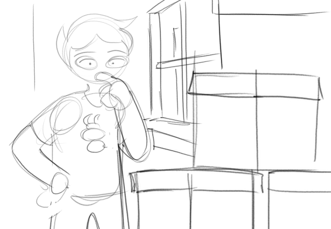
Just to express how loose planning can be, here's an example storyboard from the very first version of [S] Open, the first page of the comic.
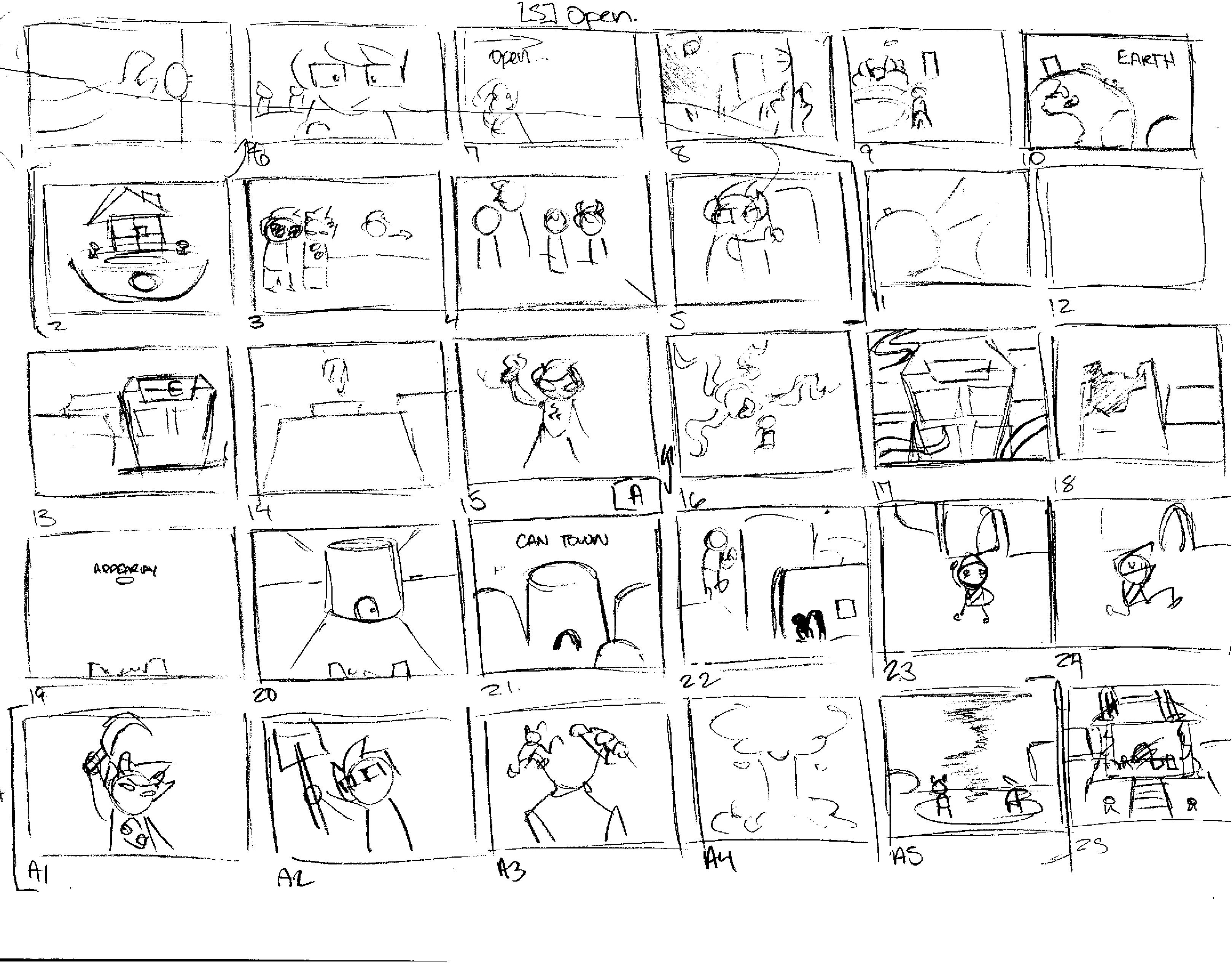
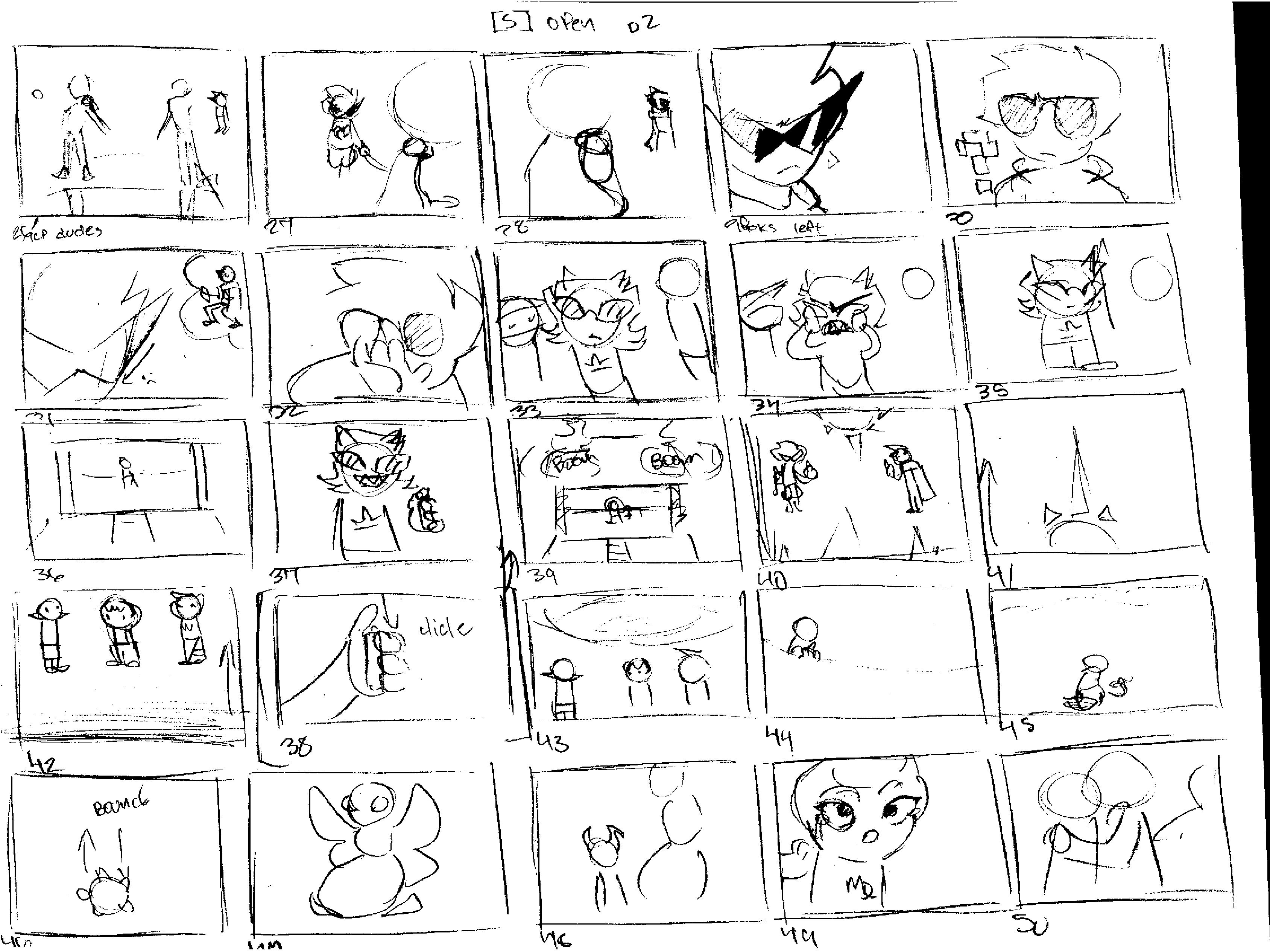
A lot of this got scrapped or reworked. It's not even really the same flash at all anymore, even if it hits a lot of the same emotional beats.
The point of storyboarding and prepping like this is to know what you're going to do on a panel *before* you're doing it.
Unless you're posting them to Patreon or something, nobody's ever going to see these, so change them, make it ugly as you need, just keep it legible - "I don't need to write this down, because I'm going to remember this" is as heavy a death flag as being one day away from retirement!
Along with the human brain being fallible, ideas that work in your head might not work on paper. You might get tempted to keep it all in your head because what works in your head might not work on the page. But this is what this step is for - turning something that works in your head into something that works on page.
Step 3: DRAWING
Here's another KRITA TEMPLATE: panel_template.kra. This might not be a good template for *you*, but that's fine, because here's where we get more into what I'd consider *my* work flow, rather than just good form, and how I get a decent-looking panel pretty quickly.
It contains the layers I tend to use the most, already set up.
Step 3 Step 1: Sketch
Sketch out your panel, referencing the storyboard as necessary.
One of the things in sketching is that it's only necessary to keep things *legible* - ideally, none of the sketch is going to be visible in the end result.
I use the pencil brush for this, since thin lines make it easier to imagine where forms start and end - in the style I work with, this is invaluable, for reasons you'll see in the next segment.
Make sure that this is as legible a sketch as possible - if you want to rescale things, adjust your panel composition, etc. etc. now's the time to do it, since the brushes we're going to use in the next steps don't play nicely with the transform tool.
When drawing characters, it's good form to translate hair directly from a sprite, if one exists, since hair on characters in Homestuck acts less like hair and more like... a shape representing hair, if that makes sense.
Even better, if you can memorize how a character's hair looks, it's easier to reproduce since you'll save time on cross-referencing.
Step 3 Step 2: Lines
Now that we're here, switch over to that pixel art brush tool and go over to your transform tool and set that scaling algorithm to nearest neighbor. If you touch anything else you will be EXPELLED from my art school.
(This is not true. I will not expel you. However, nearest neighbor is the algorithm you want because it preserves pixels when scaling both up and down. You may want to use other algorithms to scale down if you're scaling down extant assets - Lanczos3 is pretty good for preserving quality across rotation if you've got a LOT of noisy, antialiased pixels. But keeping your pixels clean and simple and aliased will save you time and energy.)
This is kind of impossible to see. I'm selecting screenshots from the Krita process recorder, and they're all saved as JPEGs. Imagine this on a transparent checkerboard background!
You may look at this art and ask - how are you talking about line weight when the defining art style is predominantly lineless? And the answer is simple - the lines are *there*, they're just *implied* rather than directly visible! The barely-there presence of lines in blocky art like this is generally used as an excuse to ignore the theory in what makes good line art, but it's a huge missed opportunity.
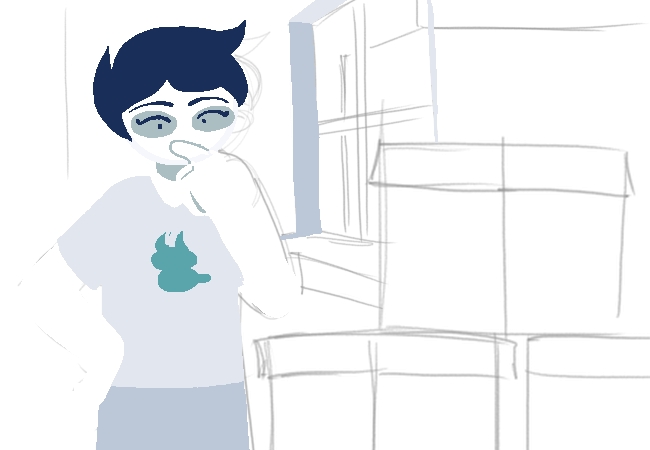
When lining a character, you have two options - we'll call these options Act 1 and Act 6, from the parts of Homestuck most defined by their styles.
These two styles are actually only 4 pages apart!
Act 1-style pages rely heavily on thick lines with heavy weighting - a big, chunky-lined character with vibrant, strong colors. For this, you'd want a big brush - I'd go up to 20px, which is pretty big for 650x450, accounting for pressure sensitivity. There's some good tutorials out there - MSPFA is more or less run by people who love to do this style, and it's certainly not terrible. This style works best with comedy beats - after all, it's basically a cartoon from the mid-2000s with how big those lines are.
Act 6-style is a bit different in that its only visible use of line is to divide forms - overlapping shapes of the same color will get a line to define where they overlap and not much else. Just draw with the color you're going to make the whole object, and then fill with the bucket tool. This style looks really good, IMO, and it's fast to make as well - while line weight still matters a lot to a good drawing, it matters *less* here. You'd really want to follow your sketch closely here if you can, since the style is all silhouette, without the margin for error provided by the thick lines.
When drawing, I tend to draw the outlines of shapes, and then fill them in with the bucket tool - again, it's a time saver. This is the number one reason you should try to keep semi-transparent/"noise" pixels to a minimum: when dealing with things like the magic wand tool or the fill bucket, every pixel you have to go in and change manually is time lost, and a break in your flow.
This is also why I draw on a transparent background - when your characters' base color is sheet-white, and there's no dark lines to break up their forms, a white background makes it difficult to tell where your characters start and end.
This is where the color palette comes in.
(YET ANOTHER DOWNLOAD: bdth_palette.kpl)
This is an adjusted version of the default Photoshop palette - it includes a bunch of colors you'd want to keep consistent for Homestuck art - God tier outfit colors, blood colors, cherub, leprechaun, and troll skin, as well as some more things that I just had on the palette that aren't as important. The Photoshop palette comes with a large suite of easily tapped greys that help keep your comic's colors consistent from scene to scene.
Keeping track of this is hard, but it's certainly not *impossible* - I tend to default to using #FFF white for humans, then the grey trolls use for skin as detailing - Jane's glasses are troll skin grey, and then the grey that is used on eyebags on trolls for detailing beyond that.
Step 3 Step 2 Part 2: Backgrounds
I tend to do backgrounds and character art at the same time.
Krita specifically has a BUNCH of really useful assistant tools for drawing backgrounds - the one I use the most is a vanishing point, which is just one-point perspective but hey, I'm certainly not going to complain about it doing that for me. The MSPA house style doesn't actually care much for perspective or scale - even when flaunting it for a dramatic shot, it's certainly not something made to be perfect. But they're useful tools to have, especially when populating rooms with dressers, beds, closets, windows, etc. etc.
Background elements and environment design are really underutilized tools in a lot of MSPFAs specifically, since they tend to be character driven, but they're really, really useful and help make sets cohere into locations.
Step 3 Intermission: When can you get away with not drawing a background?
This is a complex question because it's more or less based on the demand of a scene - a lot of Homestuck backgrounds are sheet white or stark black but this is more of an environment design thing - the rooms of a kids' walls are white, the space that surrounds the meteor or the golden ship is black.
If you don't want to draw a background, I'd recommend looking for photos of space and photos of the sky, just to paste in.
On another note, lots of artists HATE drawing backgrounds. My theory is it's because they got into character art first, and never developed the skill. However, I'd like to argue a point: If you are making a hypertext comic with small panels, there is no place better to learn what makes a good background. Part of background anxiety, at least for me, is that the canvas is big, and you need to fill it. However, while this is true, a canvas is only 650x450!
The rule I follow is "You need to draw at least one background per page." since any page could be a reader's first. However, this is a rule imported from comics where they will have more than one panel per page, and there's no denying that this is a LOT of work.
However, hypertext comics pull from video games and animation as well as comics, so you needn't redraw backgrounds every single time - reusing backgrounds and drawings is not only not cheating, it is one of the best tools you have.
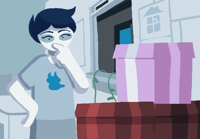
In practice, this is all you really need to get the most out of the MSPA house style. From here on out, here's some touches I like to add to make things look just a bit better.
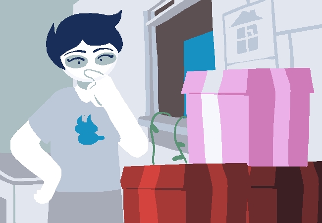
Step 3 Step 3: Color grading
The template includes a layer set to light opacity and the Color blend mode. This is a pretty useful tool for helping panels cohere as well - I tend to use blue overlays here, in a similar execution of "filming day for night", a technique used to make night scenes legible.
This layer overlay shifts all your colors beneath it towards the color on this layer - an orange overlay will make colors lean more orange. It doesn't work on colors that are either #FFF or #000, but works wonders on greys between the two.
It's easy to overdo it with this - I tend to lean very heavily on it in night scenes, of which there are a lot.
You could play a lot with blend modes - some of the more visually interesting ones are Divide, Hard Mix, and Color Dodge.
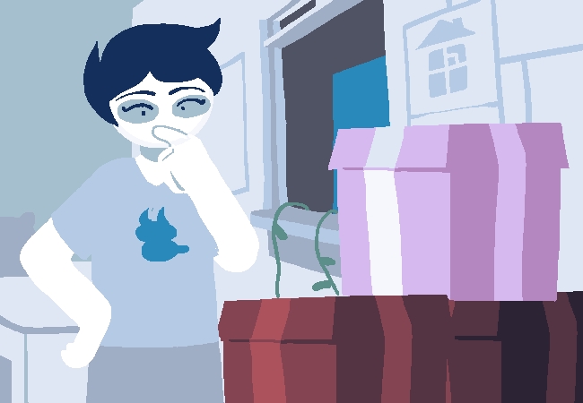
Step 3 Step 4: Shading
This is a pretty common digital art technique, but it's one that's kinda shit on for being the most directly "a digital art thing". Drop a layer set to the blend mode Multiply and shade your drawing in a dark, yet saturated color. A dark fuchsia or blue will work wonders. It takes some practice to getting this right, but it helps a lot when it comes to making things fit into a space.
Process videos
There's actually three panels here, since they all use the same recording folder since they use the same base file. Krita's process recorder is still in development.
Miscellaneous how-tos
There's some techniques I didn't really cover in the main workflow since they don't fit super nicely, but I still want to cover since they're a pretty big part of it.
Photo integration
Photo integration is maybe the hackiest thing you can do in your comic's art, and I do not mean this derisively. Get that bread. Rise and grind. You know.
However, finding good photos is difficult - spending time magic wand-tooling out every pixel you don't want is a HUGE time sink so my recommendations are this: Look on shopping sites. If you want something, go search Home Depot's website for it before you look at Google Images, especially now that GIS is loaded down with fake transparent PNGs that are worse than nothing.
I'd also recommend Sketchfab - a lot of uploads there are put under licenses that allow you to use them in other things so long as they're credited, and just screencapping Sketchfab's preview tab from an angle you'd like is so, so easy.
Actually putting these images in your panels is pretty simple, and there's a few ways you can go about it, and each way has its own way of managing the inherent difference between photos and drawings - we'll call these methods Homestuck, Vast Error, and Psycholonials.
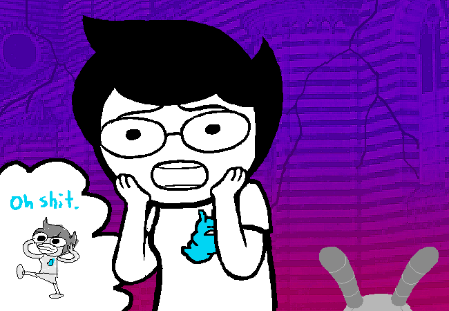
In Homestuck, the toolset would be to import your image, and then desaturate it, then crank up the contrast. This is pretty simple and results in some pretty shitty-looking images, but hey, if it works, it works, and it clearly worked!
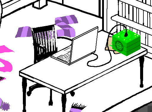
Oh yeah. Take a look at that chair.
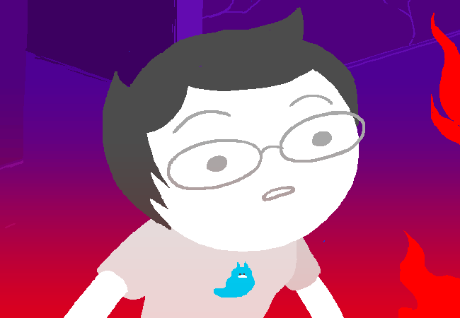
In Vast Error, photos are integrated in more colorful ways - this is the higher end of the effort scale. The big thing here is that they apply posterizing and oil painting filter over the things they integrate, which helps remove the excess detail that give away photos being pasted into a panel, while preserving the details. This takes some fiddling, but it has the best-looking results, IMO.
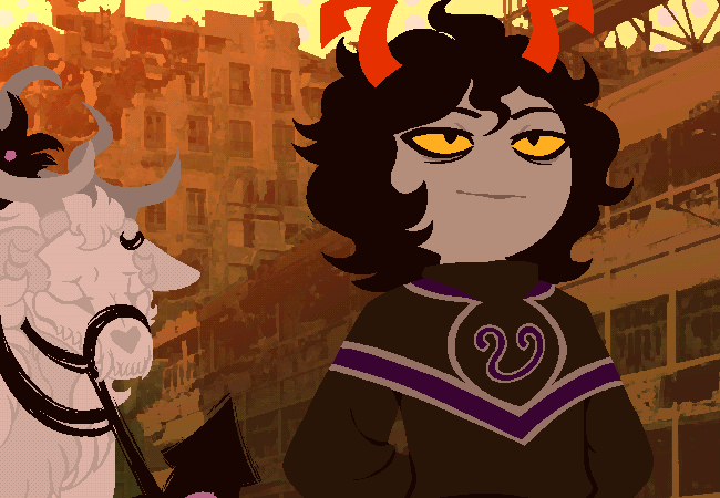
It looks so scary good.
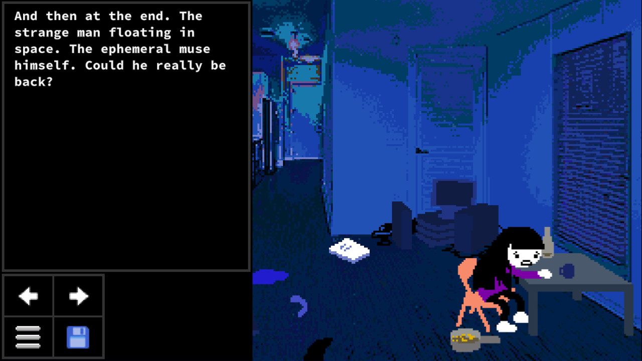
The last way is how it's done in Psycholonials. This looks the "least good" if polish is what you're looking for, but the important part is that it's something you can get away with, with minimal effort - images are imported directly, and then hit with a pixelate filter, as well as contrasted and colored as necessary.
Psycholonials's method also doesn't care particularly about mixing pixelize filter sizes.
For all of these, I'd recommend futzing about with the gradient map tool that Krita provides, since it can very easily apply really striking colors to a greyscale image.
Animation
While more complex animation is outside the scope of this tutorial, I do want to just say this is not as difficult as you'd think - a lot of panels in hypertext comics are looping GIFs, often with just 2-4 frames that consist of jittering bits of the image around.
When moving pixels around I try to keep jitter animations simple - I don't move characters more than one pixel per frame on a jitter, because it can convey a bit *too* much action, if that makes sense.
If you're looking for reference, take a look at the Chrome extension GIF Scrubber, which will allow you to play a GIF frame by frame, so you can take a closer look at how it works.
In Krita specifically, it takes some effort to get animation set up, since you'd need to have a build of FFMpeg to reference when it asks for it, because of the way Krita handles animation. Thankfully, FFMpeg is common enough a tool that you probably already have a build of it somewhere on your computer, and it's free to download, even if it probably doesn't really do much for you outside of enabling Krita animation.
Theory
Here's some points in the Grand Theory Of MSPA Appeal:
- The most important part of drawing in the MSPA style is speed and efficiency - at peak speed, you're putting out 5-10 panels a day, with long pesterlogs. In return for this high output, you're sacrificing a lot - visual fidelity is the biggest one.
- Draw your characters repeatedly before you put them in the comic - figure out which bits of their designs you don't like to draw, and if they're not essential to the character, cut them out! This isn't Final Fantasy, you don't have to go all out on design complexity.
- Remember that MSPA comics tend to skew towards experimental - try things out! One of the most important points in developing how I think about comics was the realization that a panel is, at the end of the day, just a PNG that gets uploaded to a certain place, and who cares how you get there? If you want to paste in images from other sources, go for it! And remember that even if experiments fail, you've still learned something from it, too.
More general advice
- Even if the art style for your comic is so cartoony it hurts, do your studies! Doing gesture drawings, life drawing, whatever, keeping the fundamentals strong is essential for improving at art.
- Keep an art resources folder if you can! I have an external hard drive just for keeping huge, fuck-off sized bundles of art resources, things like 3D models of cities, photo references, landscapes, color swatches that I'll probably never use - you may never use them, but the more options you have the better!
- I thought I had more to say here. Oops.
Additional reading
- Yorsh's Homestuck art style tutorial - Written by the author of classic MSPFA Heinousstuck.
- Sub-link: Homestuck resources, a long-dead blog that catalogued resources for Homestuck fan artists. A lot of the stuff is missing or links are dead, but there's certainly not *nothing* there.
- helpfulharrie's #comics tag - Harrie is a good friend of mine and endlessly smart when it comes to comics, and their art resources blog has carried me through quite the tough execution at times.
- Understanding Comics: The Invisible Art by Scott McCloud. Everyone cites this guy and it's because it's the only real write-up on the form of comics for now! Even as hypertext comics stray from traditional comic language, it's invaluable to know *how* it strays from that.
- Blue Period by Tsubasa Yamaguchi. This manga shreds and helped me start thinking about art in ways that really changed and made my process better.